Your response is detailed and through and you have been creative with your blogs, I particularly like the use of layout and design which is good presentationYou have a secure knowledge and understanding of who you want your artist to be signed to; perhaps you could link this further by stressing the advantages that your artist has signed to the particular record label. Your clearly identify your target audience and have profiled them well. Good research into CD covers and you have a wide range of examples, and this would be developed further if you can link the real product to how it will influence your own designs.
Friday, 30 September 2011
Domino Records
 We decided as a group that the best cmpany to represent our band would be Domino records, Domino is a british independent record label. Despite being independant they have branched out all over the world to such places as America, Germany and France. Domino Records have had a good run over the past with artists and bands such as The Arctic Monkeys, Franz Ferdinand and Queens of the Stone age.
 DIGIpak First draft.

Here is my first design idea, following what I said on my last post about album covers I like and I feel would be a good start for this up and coming band. The image on this page although it was taken by me it has nothing to do with the band in question. The image is of a man walking alone up a steep hill, the picture has a lot of head space meaning that he is on a journey or perhaps "RUN"ning from something, The male is in silhouette form sort of conforming to what I said about him not being relevant to the band. "Cape Karoo" is the biggest writing as the band name is what we need people to remember and the Album name "Run" is the only writing the right way up because it is still important but smaller text.
Thursday, 29 September 2011
DIGIpak Covers

Album cover research.

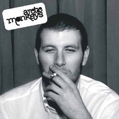 Above are some album covers much like the one I feel we should have for our band this year. The images on the front of the DIGIpak have nothing to do with the band in question. Starting from the left The arctic monkeys CD cover; this has no album name and the male on the front is not even in the band he is simply a friend of the groups and I am sure if you dig around there is a valid story behind this image. Then we have vampire weekend the image is that of a chandelier and the framing is off meaning the picture is crooked and again has no album name or anything. Then we have the right image taken from the front cover of "Favorite worst nightmare" by the arctic monkeys; this again has an image that has nothing to do with the album or that band but some how works. With all the images on this page as references I think you can see for yourself where I think our DIGIpak should be heading.

Monday, 26 September 2011
Our Target Audience.
Below is what we feel is the criteria for the target audience of the band Cape Karoo that we have put together.
- Both male and female audience between the ages of 17-35.
- Underground and experimental music followers.
- Blog followers.
- Indie fans.
- People who prefer the use of real instruments used creatively rather then fully electronic-produced.
- Fans who appreciate music for the talent rather than the star image.
- Festival goers (Glastonbury, Isle of White etc.)
- Alternative and creative profiles ( artists, musicians etc.)
Targeting specific audiences means that we can work out a more effective marketing scheme. We will advertise this band using popular blogs we feel the target audience will keep an eye on as well as at festivals, underground events and also in magazines such as "indie" that I feel targets our audience directly.
The Treatment
The song we are thinking of doing is Run by Vampire Weekend. The reason why we chose this song is because it has a lot of different instruments which sits perfectly with our music video theme of the marching band.

We are planing of using random retro shots such as children at play etc. We want to do these shots with an over exposed sephia effect to give it a ''home-video'' feel.

We will use the idea of a marching band in the field, like in the music video I Love Your Smile.

We also want to include shots of the environment like the field, bicycles, closeups on flowers etc.

We are thinking of using various cameras for our shoot, because the desired effect isn't a perfect, clean shot, but rather a retro, indie feel.
Our song.
This our chosen song, Run by Vampire weekend. We chose this tune because it is fairly unique and really fits in with the video idea. Hippies, instruments, miles and miles of open land and friends, barns and a party all of which go hand in hand with this music genre and most importantly this song.
Levis- GoForth
Here is an inter-textual reference to our music video, the way it is shot is sort of what we are looking for very, independent. I think the main scene that we enjoy is the one with the feathers and I believe we are going to use this in our video. The run rise and the bon fires, the girl in the Indian style feather jacket in the wind and the cult followings- all of this will play a big part of our music video.
Thursday, 8 September 2011
Prelim Evaluation.


Seeing as this was out first chance at shooting a music video or at least a section of a music video I feel it went quite well. We worked well as a team and had all of our shots planned which meant we could go straight in and get to work making our shooting time less leaving us with more time to edit.
Once we had finished filming we hit the edit suite to finish up, being the first group to shoot meant that we had more time to edit so we had no reason to worry about not finishing. We started with putting all the appropriate footage in the appropriate bins and then got on with the editing, we started with editing on the beat for the first few seconds as each instrument was introduced and then went into standered cuts and fades.
If I had the chance to do this project again I would probably have spent more time on making the set look a little bit better as I feel it looks a tad tacky. Also I would have liked to have met the band or atleast seen a video or a picture so I knew what we where working with because that way we could have planned our shots with the band in mind instead of just what we thought would look good to the music.
Prelim album cover.
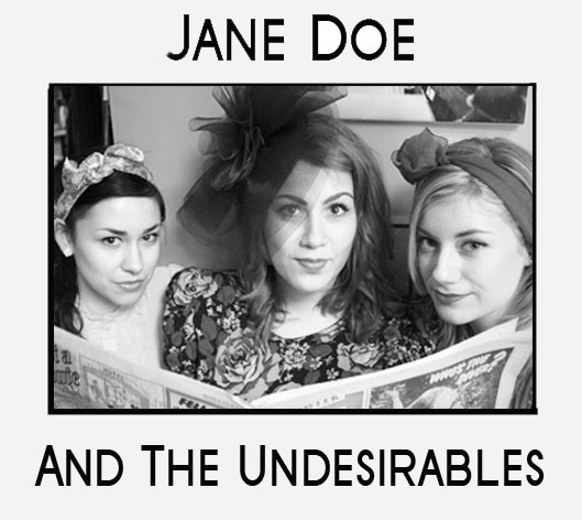
We chose to design the cover in black and white to represent the style of music that the band make, which is in the style of retro. Their style also seems quite 50's or 60's like, and so the black and white photo suits the band for this purpose. Furthermore, in the photo the 3 girls are dressed in a sort of retro/60's style so this just emphasises the image even more. We chose the three girls to be on the front cover because they represent the band more than the boys who are on the instruments as they are the front girls and give off the image. We kept the writing to be simple but effective, and so it is just bold and black. This was so that the band did not seem tacky.

On the back cover, we have the 3 girls in a more natural position and they have not realised a photo has been taken and so are laughing and having fun. This gives off the feeling that their image is not false and stops a fake image being given off. In the photo on the back cover, there is a boy (the drummer) sat next to them to show that there are more band members and that it is not simply a typical girl band as there are boys present in the band too.
Jane Doe- Naughty
Before the summer holidays we did a prelim task to give us a taste of what it would be like to shoot a music video. We where split up into groups of 4 and each given a section of the song. My group had the first 45 seconds but I will upload just our part soon.
Subscribe to:
Posts (Atom)